Thursday 20 January 2011

Progress Update

Just had a conference call with Yuki about the next thing to do for the project.

We have decided what we want to have finished by the time we go back next week and for me that means doing a sketchy background for;
-first 3 shots
-staircases
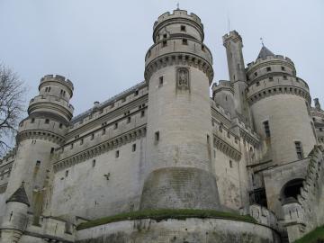
-princess tower at the end
If possible!

So far I have very roughly done the first three shots;


And sent it to Matt to check, I kept it quite basic as I wanted to get the layout correct before I do anything else. Here is our correspondence;

The roughness is good, that's how these early layouts should look while we decide which ones to use.

There's nothing wrong with the angles but both shots have to be larger. If you pause on the very first shot of the animatic you can see how much of the tower needs to be shown. Therefore your 2nd drawing will have to show more of the tower and be bigger so that when the camera zooms in through the window you can't see the pixels.

The first shot is good, but again it needs to be slightly larger. Keep the drawing as it is but fill it out around the edges slightly so when we come to compositing and start moving the layers there won't be any unfilled areas around it.

I don't think i explained it very well. Try to think of the first scene as a load of moving layers not a static shot, so that tower is a layer, the bush/tree in the foreground is a layer, the landscape in the background is a layer and the princess's room is a layer. They'll all be moving at different speeds so we have to watch out for any undrawn areas that are not covered/hidden when they overlap.

If i'm not making sense move on to another shot and i'll explain later. Thanks


Hi Matt,

when you say larger, do you mean more zoomed in or showing more of the background of the tower?
and would you like me to draw the different layers separately?

-Michelle


the landscape (background)
the tower (foreground)
the tree/bush in the (foreground)
the princess's room (middle)

Ye, all the above have to be separate drawings so we can move them as layers in the compositing. You'll probably want to save them as PNGs as well.

By larger I meant 2 things, first that they will need a high resolution since they're bitmaps, so when the camera zooms closer to them the pixels won't show.
And second, more of the environment needs to be drawn i.e. more of the tower and more of the princess's room, so when the layers are moving together there won't be parts that are unfilled or undrawn showing through where there is no overlap.

The best way to describe it is to show you. So i've uploaded the premiere file of the animatic into the A drive account. Hopefully it will open without any probs. If it does, focus on the first shot and toggle the eye symbol/visibility of each layer to see what they're all doing individually. It should give you a better idea of how the whole shot comes together.

If its not happening I'll be able to explain it to you when we get back ten times quicker, so have a go at a different shot instead. Thanks.


So I need to put the layers into consideration, but for now I might just have the roughs done and then discuss the layers with him when we next meet in person to save time and confusion! So onto the other princess tower shots and staircases..

Monday 10 January 2011

Entrance Hall more sketches

Final things that have changed for the entrance hall sketches!
I got some more feedback from Matt via email about what to do to improve them;

---

Entrance 2 (guardian entrance)


Ye I didn't see much wrong with angle of this pic from the beginning so i think it's pretty much done. Although I'm having second thoughts about the crop I gave you, I think the doorway works quite well from a more near centre position for this shot cos the guardians will be bursting through, so it might be more dramatic keeping it how it was. But since it's just a crop you don't have to do anything to it just keep the original composition (with your ammendments to the pillar) and i'll decide later how to frame it. Sorted.


Entrance 1 (Don's entrance)

(pictures i sent him attached to my email)


I think the third one is the best. That said, it's hard to say exactly which one to choose until I see if i have any problems with perspective when i animate over it.


As you mentioned, I think the most productive way to work next term is for you and yuki to give me very basic backgrounds with the layout, you know just structure lines vanishing points and the horizon line, I'll begin animating and if it works i'll give you the okay to colour it, what'd ya reckon? It's kind of a learning process for all of us so we'll have to just try something and see if it sticks.


---

So heres the new sketch of the entrance.. But possibly not the last!


So over the next few weeks I will most likely be posting more sketches like this rather than proper finished ones although me and Yuki might attempt to collaborate on colour at least once so we know what the style will look like!

And just so I remember... the dimensions we need to work at are 1024 x 576 and the animation is at 25 fps.

Thursday 6 January 2011

Re-doing the Entrance Hall

So I sent the images me and Yuki had worked on to Matt yesterday and today he replied with some helpful suggestions. Here are the images he sent back, with the crops/changes he wanted;


---
Main hall pics:

Everything looks badass so keep it looking like that. Some nitpicking though; i noticed the the chain of the drawbridge on the outside, that would actually be the inside of the watchtower - a very short sort of tunnel before you reach the main hall. Check out the environment floor plan to see what i'm talking about.


Don't rush into the colouring until we get back cos I would like to okay the layouts before you go for it, just so you don't have to redo anything major if something needs changing like you said.


As for the angles, i've attached your pics with adjustments. I started drawing all over your image but then realised I could show you what i meant just by cropping so don't pay too much attention to the first one.


Basically make the entrances more off center and the camera lower in the main entrance one, so Don doesn't look so vulnerable with the camera hanging over him. I added a thumbnail in each pic to show you the composition i'm thinking about. The rule of thirds is what i had in mind, try and keep all the Hans Bacher layout stuff at hand.


Also you might have to bring the windows down and push the pillars inward so it all fits in the frame but if it doesn't look right in perspective then leave them out.


First shot;


Second shot;


Maya banquet


The models look great, i wasn't expecting that much detail. All i'd say is make the table quite a bit longer so you can make the zoom faster in the same amount of time. And if you can, use the graph editor to ease the camera into a sudden stop at the very end.

---


Hope he doesn't mind me quoting him there =p

My first attempts to see if they are accurate, once i get another reply from Matt I'll finish up the sketching for them.


And the improved table zoom..

Wednesday 5 January 2011

Maya Test for Matt

One of the reasons I've been getting to grips with Maya again is so that I can help out with the group on the animation and a little while ago Matt asked if I could create a blockout in Maya of the banquet hall and render out the camera zooming down the table so he could rotoscope some animation over it.

Here is the finished result;


It's very basic, but it should get the job done, have also sent Matt the two sketches I completed and will wait till I hear back from him to continue with them in case they're wrong. Me and Yuki are going to try very hard with them and it would be a shame if the only reason they didnt get into the film was because the angle was slightly wrong or it wasn't zoomed in enough or something.

Collaborating with Yuki

Haven't updated for awhile as I've been busy with an outside Uni project, but myself and Yuki got together yesterday (04/11/11) to start collaborating on the backgrounds!

We decided to try and attempt creating the entrance hall, so we met on Skype and spoke about what direction to go in, and watched clips from 'The Sword in the Stone' and 'Sleeping Beauty' to get a good idea of castle interiors and perspective;

Again I used Maya to help with the perspective..


and Yuki helped by putting on clips from 'Sword in the Stone' and 'Sleeping Beauty' for castle interior ideas as we worked.


This is what I have done so far, am just sending it to Yuki now to improve and then we can begin to add colour! We will use a mixture of Photoshop and SAI and try and draw it in the desired style of the film.


and the other end of the entrance;

Maya is super-helpful! I think I will definately rely on it in the future and for any other projects since it's really saving me time where I might have been struggling before.


RESEARCH
As I've written in previous journals, a lot of the research and inspiration for the castle designs came from Matt's moodboards;


However, I have recently found the BBC series 'Merlin' to be of great significance in my inspiration for this project. The series was filmed at the Château de Pierrefonds in France, an amazing castle with designs that really match the style we want. Here are just some of the images I'm going to keep in mind whilst drawing the next few sketches;


All of the above images were found using the 'bing' search engine!
Should be good for designing the entrance hall and some of the outer part too I think.

Next I'm going to do a quick animatic in Maya for Matt of the camera zooming down the banquet table so he can rotoscope over it and start animating :)
And start colouring these backgrounds with Yuki!